Responsive Email Design by Mack Gorski (webinar review)
Learn how to improve email design in couple of steps.
Mack Gorski,Education Expert at GetResponse explains what are mobile emails,
the importance of creating responsive mobile emails,the best practices and basics
of designing for mobile devices and quick presentation of drag and drop builder.
Watch the whole webinar here.
This post contains affiliate links.
Mack Gorski,Education Expert at GetResponse explains what are mobile emails,
the importance of creating responsive mobile emails,the best practices and basics
of designing for mobile devices and quick presentation of drag and drop builder.
What are mobile emails and importance of responsive email design
Mobile emails are types of emails that are aligned with usage of iOS,Android and other
mobile devices and that can be displayed on such devices.
According to thinkwithgoogle.com 68 % of smartphone users say they check their phone
within 15 minutes of waking up in the morning.
This data is provided by the Google Consumer Surveys research made in August 2015.
iOS market share was about 20 percent in the last quarter of 2019.
These information show that going mobile is a must even with your emails.
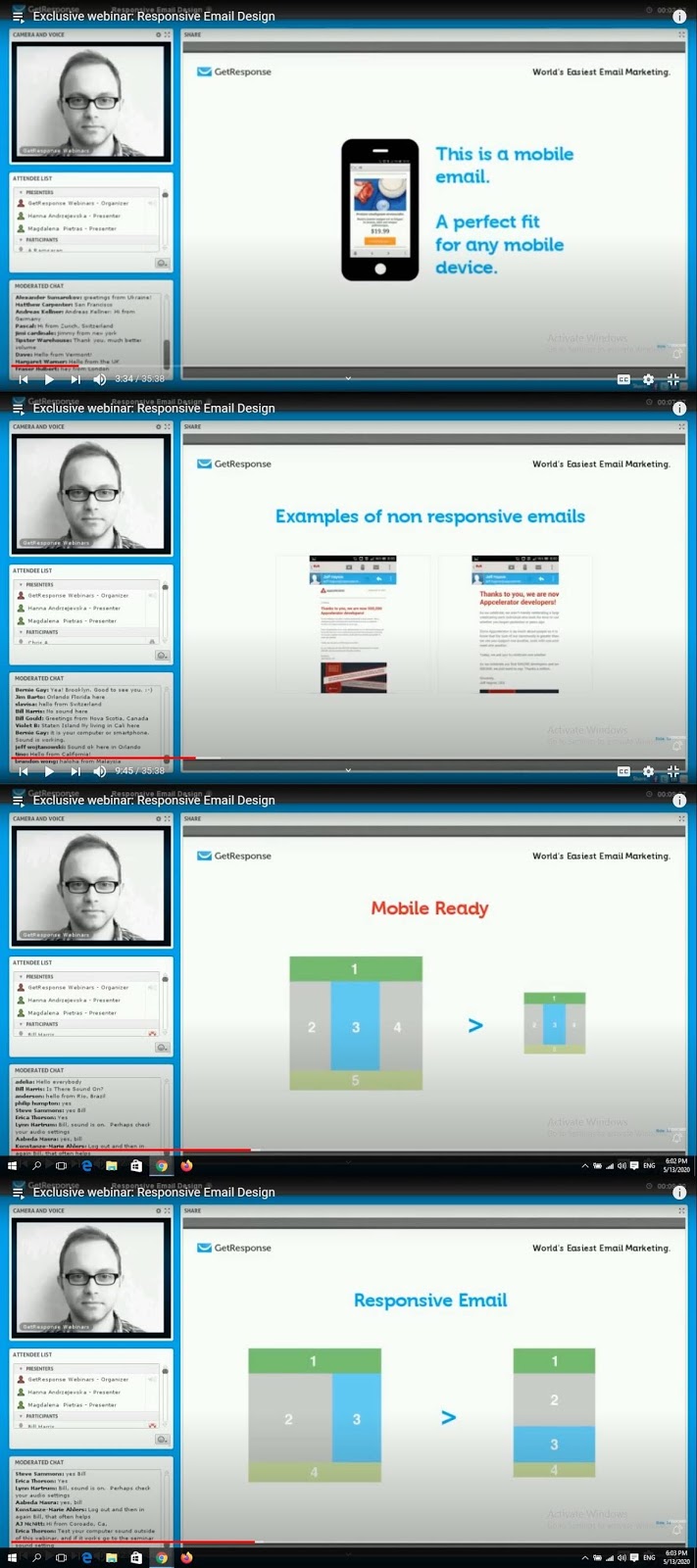
Mobile emails fit seamlessly on every mobile device.
Non responsive emails are hard to read,they have small letters and small CTA's.
We need to differ mobile ready templates form responsive ready templates.
Mobile ready templates resize existing emails into the smaller versions on mobile devices.
On the other side,responsive templates have handsome structure of a message in order.
Example are mobile emails with content sections being vertically placed below each other.
screenshots taken from webinar hosted by Mack Gorski and GetResponse
Rule of thumb is starting with a header,then with a first block of text below,
second block of text bellow a first block and placing a footer in the end of a message.
While other ESP's offer few pre-designed responsive messages,you may only
work with fixed layouts and mobile emails are scaled which is known as fake
responsive behavior so choosing convenient ESP might be hard.
Luckily with GetResponse you can create responsive emails from scratch.
Choose pre-designed templates that are designed for responsive behavior.
Best practices and basics of designing for mobile devices
As always previewing emails to see how they fit on mobile devices is a good start.
We need to take care of images,copy,fonts,padding,spacing and CTA's.
Make sure that image quality is optimal so you do not create opposite effect instead.
Try 14 pixels for regular text and 22 pixels for headlines.
Add 10-20 pixels of extra space around clickable areas.
Clickable areas should be approximately 44 x 44 pixels,minimum 29 x 44 pixels.
CTA's need to be recognizable and easy to click on.
Choose buttons that invite for clicks.
Drag and drop builder for mobile emails
As explained before left to right blocks are placed vertically one below another.
We are basically building a vertical row with the images and texts.
Vertical view is favored even if you decide to read your mobile emails while
holding your mobile device horizontally.
Messages,text and images will be a little bit larger in horizontal view but principles of
placing elements one below another are the same as for vertical view.
We are putting best practices in place when taking care of the pixels and spacing
between the elements.
We can resize an image in a header and elements can be added automatically with
a click on each one of them if you do not want to drag and drop them.
Rearrange content and delete unwanted images.
Any image that you put in an editor adjusts itself for the mobile view.
Change the color of a button if you like.
Preview your mobile emails a couple of times before you publish them.
Watch the whole webinar here.
This post contains affiliate links.
At no additional cost to you,I will receive a commission
if you click through and make a purchase.


